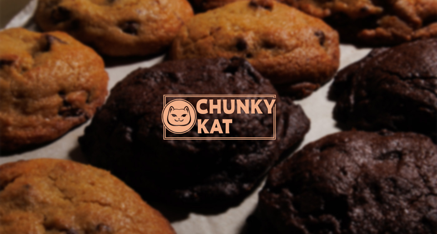
Chunky kat began on 2025 offering baked goods, focusing on sharing and providing treats to eat together, either on the dinner table or elsewhere.
The name comes from the owners cat, who's a social cat that likes to be where visitors are in the house.
The brand wants to have a social and warm personality. Being display mainly in social media with pictures of the products and printed posters posted around the city.
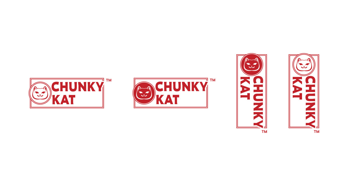
Logo inspiration came from the owner's cat and japanse hanko, althought the final product isnt a square like traditional hankos.
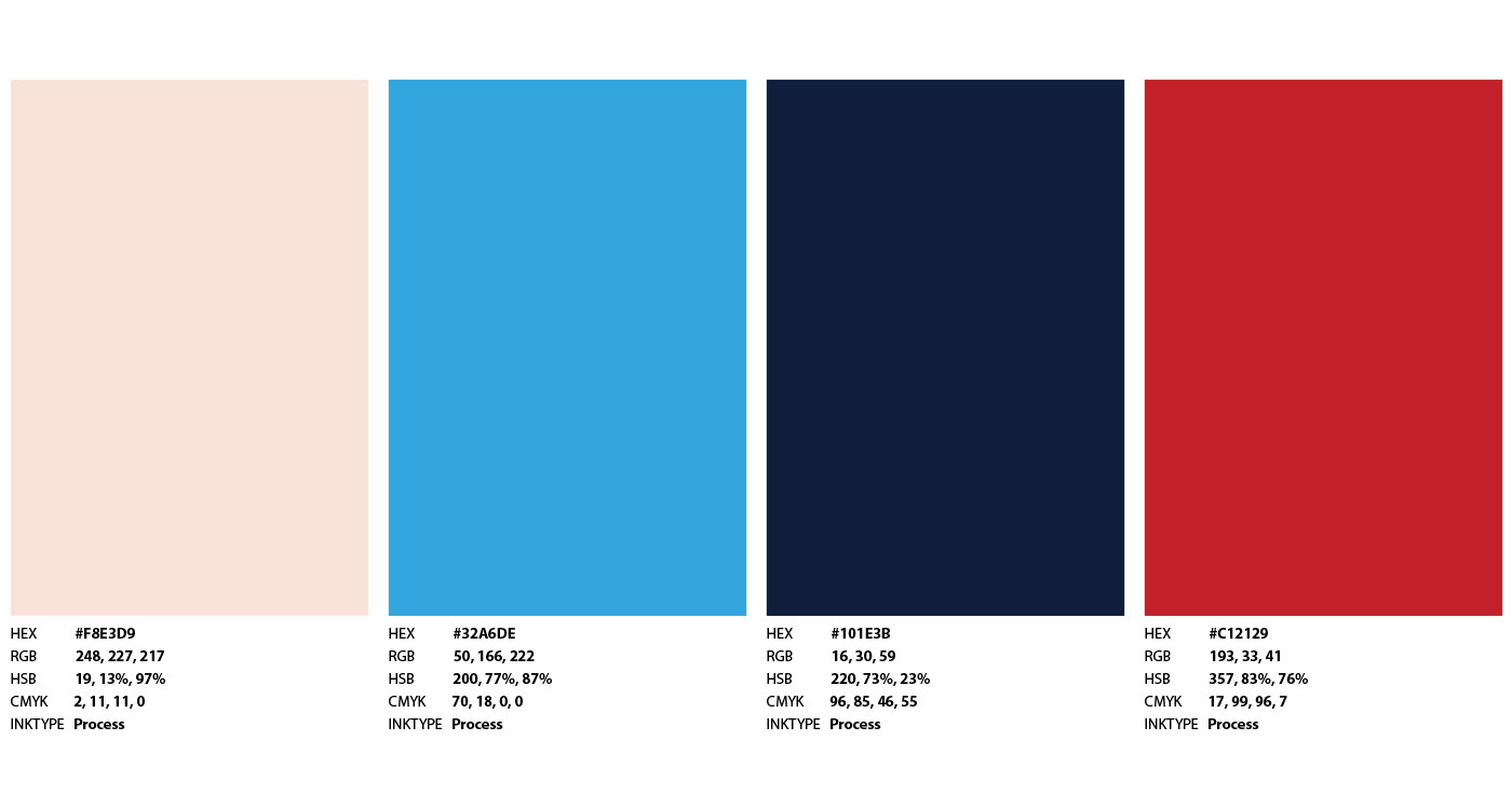
Color palette was chosen to have contrast with baked goods that have the traditional pale brown colors.
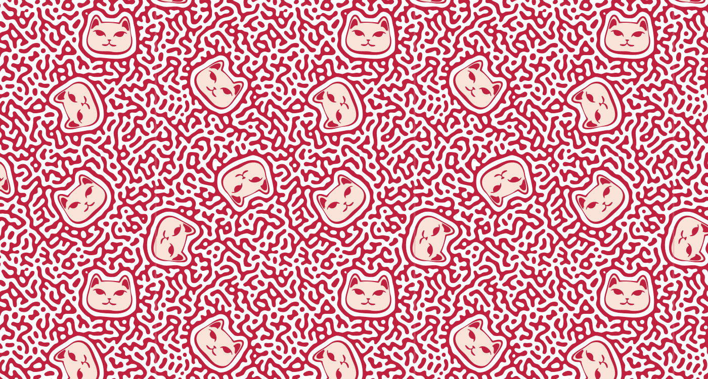
The main pattern used is inspire from turing tesselation with random-like placement of the cat's face.
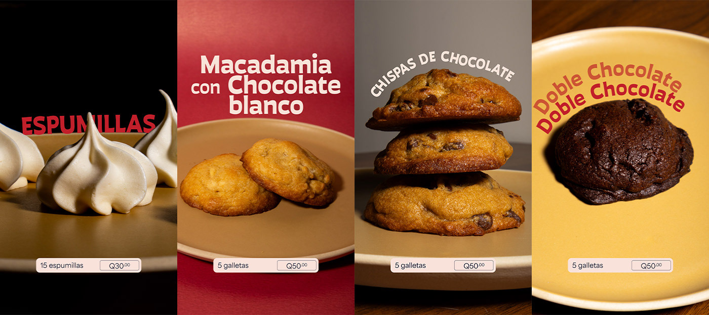
For social media, specially highlights, pictures with little photo edition and typography showcasing the name of the product was used.
Another important aspect is video animation, something that doesnt require that much effort to be great but still looks good. For this, the first animation and video for the brand was one showcasing a new product, taking pictures putting and then removing said products, following text with a call to action and the logo for finish.
Thanks for reading!